AT 309 Week 11 - Making Maps with UAS Data
This week's lab covered the process of making good, complete maps from UAS data.
Cartographic skills are essential due to the way that UAS data is displayed and analyzed: on maps. Therefore, knowing about cartography, mapping, projections, as well as using cartographic essentials like a scale bar, north star, legend, and locator map necessary to properly represent UAS data. You must assign real world coordinates to the drawing or image, give it scale, contextualize it’s location (orientation and locator map) and explain what is being shown on the map (legend). Spatial patterns can help readers understand what data they are seeing and create continuity if there are multiple reports/maps/etc. I’m somewhat confused by this question but the way I see it, spatial patterns are especially helpful when dealing with multiple maps. If you have 3 maps of the same area but all representing different things (i.e. using different sensors), using the same shape to mark GCPs helps the reader connect the different maps. Another way is if you have a map that is full of a crazy amount of info, you can break it up into multiple maps while keeping certain consistent aspects the same (like state lines or, again, GCP locations), thus creating a pattern that helps make the data more understandable. o Having good presentation format and cartographically correct maps is important regarding future projects and jobs because it teaches you how to do it right when the task you are assigned is real. If you’re making a map for someone, you can’t do it wrong, as you would quickly find yourself no longer having that job or project. If the presentation format is messy or unpleasing to the eyes, then people are going to be less inclined for you to present things again.
We were asked to deliver 3 different maps of the Wolf Creek Paving Site:
Shaded DSM with transparent DSM on top with a locator map (Figure 1)
Orthomosaic Map (Figure 2) with:
Locator that shows the location of each GCP as a point
Detailed zoomed in inset for each of those points.
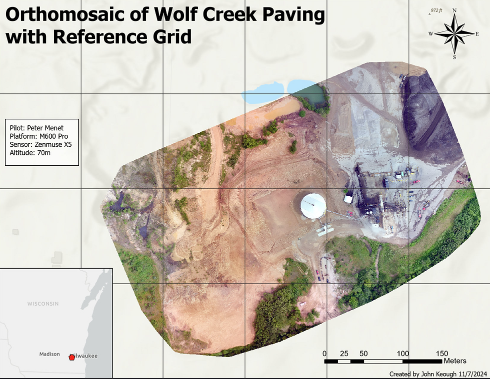
Orthomosaic image layout map with a reference grid (Figure 3)
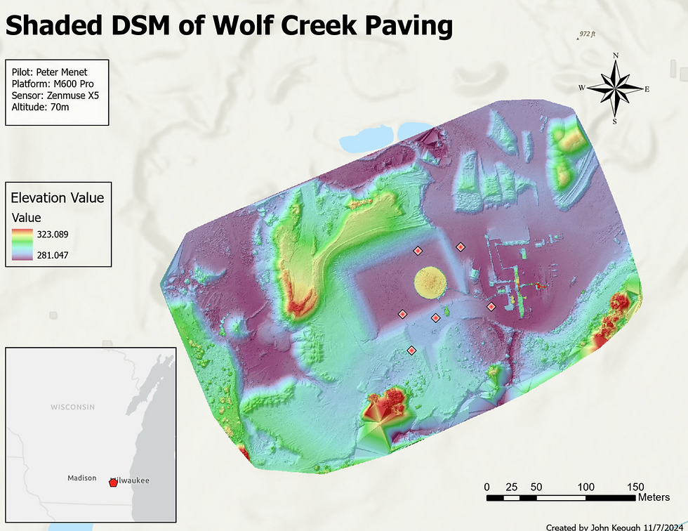
A DSM, or Digital Surface Model, contains the elevation values from everything on the surface, including buildings, trees, and cars. It helps visualize relief by color coding the elevation range. If someone can see what each color means, they can then read the map and see the elevation of the different terrain features, something that is much harder to analyze with the RGB ortho alone.



Comments