AT 309 Week 9 - ArcGIS Pro
This weeks lab served as an introduction to ArcGIS Pro, a powerful desktop GIS software developed by ESRI and one of the leading industry GIS tools. We analyzed some imagery taken at a location where a controlled burn took place, using this to explore some of the basic features of ArcGIS Pro and apply some of our learned remote sensing knowledge, like color bands and GSD.
First, we started with writing down the field data for the DoakBurn dataset:
Vehicle: Bramor ppX
Sensor: Altum set to 1ms and 16Bit TIFF
Flight Number: 2
Takeoff Time: 12:18pm
Landing Time: 12:35pm
Altitude (m): 121
Sensor Angle: nadir
It is important to have this data. The field data can give us important information and context clues that we may find useful or necessary when analyzing data. It’s especially important if two separate parties are doing the collection and analysis. The party doing collection may know details about an area or operation, but if they don’t write it down somewhere, the analyzing party may be left confused or looking in the wrong direction.
We then did a brief analysis of the bands for the sensor, looking at the peak reflectance of each.

From this, we can determine that the values for each band are as such:
Blue: 480nm
Green: 560nm
Red: 670nm
Red Edge: 720nm
NIR: 830nm
After this, we looked at the imagery and took note of the differences between each a "False Color composite" of each five bands (see figures 2 and 3 for examples). Each band has a tendency to highlight different aspects of the imagery. Here is a summary of each:
Blue band: cars and gravel patches seem to stand out, while the yellow flowers are nearly invisible
Green band: The different shades of green throughout the vegetation stand out substantially more than the blue band. Everything seems to be brighter across the board, but the yellow flowers actually start to stand out now.
Red band: The greens are much darker in the red band, while the white, blue, and yellow objects and areas tend to remain bright
Red edge band: The greens stand out much more in red-edge, while the blue and reds all become uniform with each other, you can’t even see them. It seems that red-edge would allow the delineation of shades of green for analysis of vegetation health.
NIR band: This is pretty similar to the red-edge, however there is more detail when it comes to the other colors. Greens remain bright, while reds and blues gain their definition back. Additionally, it seems that you can see a wider range of green shades.
We also learned about how to look at the properties of layers, as it can give you critical info about what you're seeing as well as source information. Here are some notable bits of info:
The X and Y cell size are about 5.62 cm, meaning each pixel covers an area of 5.62x5.62 cm
The radiometric resolution gives us a 16-bit pixel depth
The projected coordinate system is WGS 1984 UTM Zone 16N
These details can reveal to you whether or not the data is what you expected. It can tell you if everything went right or something went wrong. Additionally it may dictate any further processing/analysis settings or direction.
We also learned about using the "Composite Bands" tool to combine raster layers. This tool creates a single raster dataset from multiple bands, helping with analysis and organization. In some cases, the output of an analysis operation is a single-band raster dataset. To do further visual analysis, you may need to combine the outputs by rendering your data as a color composite.
A multiband composite lets you mix and match different combinations of 3 bands. For a normal RGB band composite, red is band 1, green is band 2, and blue is band 3. We are able to edit which band goes in each slot, being able to make our own false color composites. One example of a false color IR is assigning band 5 (NIR) to the red color, band 3 to the green color, and band 2 to the blue color. This gives us the resulting image, used on the Pre-burn images:


The same concept was applied to the post-burn images:


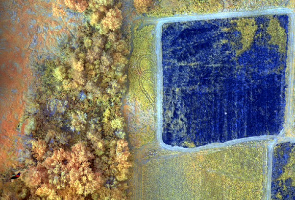
Finally, we were asked to experiment with our own band combinations. The combination I did was:
Red: band 5
Green: band 4
Blue: band 1
This gave me a very interesting image where the vegetation showed up as a mix of yellow and green or yellow and orange (depending on the type) while the burn areas became a powerful dark blue. The roads also showed up as a lighter blue. See figures 6 and 7.

This lab was instrumental in building a basic understanding of ArcGIS Pro, something we are expected to use for many years to come.


Comments