AT 319 - Final Project
Introduction
This is a report developed from a mission that was flown at the Purdue Wildlife Area. The report includes a number of maps that show different aspects and analyses of the imagery gathered from the mission. My group, consisting of Matthew Konrad and myself, were tasked with using an Unmanned Aerial Systems (UAS) platform to gather and process imagery of an assigned area and then individually produce a set of maps from that following a list of outlined deliverables. These deliverables, which are each presented as their own cartographically correct maps are:
A locator map.
A mission orthomosaic.
A shaded digital surface model (DSM).
A side by side comparison of the orthomosaic and the shaded DSM.
Digitized roads.
Digitized landcover polygons.
Unsupervised and supervised raster based classification of land covers (as well as a picture of the training samples).
A reclassed DSM showing all objects in the area over 6 meters.
A vector buffer of 10 meters from all two-track roads.
A raster conversion of the 10 meter buffer from deliverable 9.
A map showing all the trees within said 10 meter buffer.
Mission Overview
All the groups were assigned one of seven different areas within the Purdue Wildlife Area (Figure 1). Our assigned area of interest in which we flew the mission was Area 1.

In order to properly gather imagery of the entire area, we were instructed to program the flight boundaries such that it would be wider than our actual area, ensuring that none of the area would be left out of the image (Figure 2).

One thing we had to account for was the request by the PWA operators that we avoid flying over their ponds, therefore I had to ensure the southern boundary of our flight area did not intersect with these ponds (Figure 3). As a result, we had some worries that the southern boundary would not be enough to encompass the whole area, however it ended up not being a problem as we were able to capture the entirety of the area with ease.

I had to ensure that this tight margin was properly translated into our flight equipment, which consisted of a DJI Matrice M300 quadcopter equipped with a Zenmuse P1 RGB Sensor Payload using a 35mm lens. Due to the nature of DJI Pilot 2, which is the software that the M300 utilizes for its remote controllers, you normally have to draw the flight area on the screen, which can make precision difficult. Fortunately, DJI Pilot 2 makes it possible to import .KMZ files of flight areas. I was able to export a shapefile of the flight area outlined in red (See Figure 2) from ArcGIS Pro, convert it into a .KMZ file, and import it into the internal storage of the M300’s controller. From there, I imported the file and was able to perfectly maintain our carefully crafted flight area.
With regards to our platform and sensor, we made the choice to use the M300 with the P1 for a number of reasons. One reason is the aforementioned ability to import the files of flight areas. The second reason is that the P1 sensor can acquire very high quality imagery with the added benefit of a user-friendly interface. Finally, I personally have over 30 hours of experience with the M300 and P1 combo, which allowed me to use my knowledge and familiarity to achieve our goals in an efficient manner. The mission was flown at an altitude of 122 meters and a speed of 15 miles per hour. The camera was positioned at a 90 degree angle downwards (known as “nadir”) and the route had an overlap and sidelap of 80%. This meant that our mission would be flown in a short amount of time (22 minutes) while still maintaining a high degree of spatial resolution.
Deliverables
Location Orthomosaic (Study Area)

Figure 4 displays a map with an orthomosaic from our flight with a map showing its location. The blue box marks our area of interest. Because we had to give ourselves a buffer zone, the imagery partially extends outside of the marked area. Despite the fact that we could not give ourselves a large buffer at the Southern end in order to avoid the ponds, our flight altitude allowed us to comfortably include all of our area with ease.
Mission Orthomosaic

Figure 5 displays a map that shows the entire orthomosaic along with flight lines and image locations from the image capture mission. The full metadata of the flight is also included on the right side, which contains all the relevant data with regards to our flight.
Shaded Digital Surface Model (DSM)

Figure 6 shows a map of a Shaded Digital Surface Model (DSM) of our flight area. A DSM is a model that contains information about the elevation of the terrain and any objects inside of it, including things like buildings and trees. The elevation data is in meters and is displayed as a color gradient according to the legend in Figure 6. The DSM serves to visualize differences in elevation, as that is something that is very hard to discern from the RGB orthomosaic.
Side-by-side Comparison of Orthomosaic and Shaded DSM

Figure 7 displays a map that compares the RGB orthomosaic and the Shaded DSM in a side-by-side manner, both of which are at the exact same scale in order to maintain their continuity. The purposes of each type of image are put on display here. The RGB orthomosaic is better at showing the landcover and objects within the area, but it not so great at displaying the elevation features. The Shaded DSM can represent the elevation of the area, however this comes at the cost of losing the ability to accurately see differences in areas of similar elevation.
Digitized Roads

Figure 8 shows a map in which the various roads of the area have been digitized. Digitizing is when features of the image are translated into digital objects that contain data that is relevant to their identity while representing their spatial qualities. In this case, a line is drawn to represent the path of the road, and each road contains data about their type. In this map, only gravel roads, two-track roads, and trails are present, each of which is color coded to distinguish them from each other.
Digitized Polygons
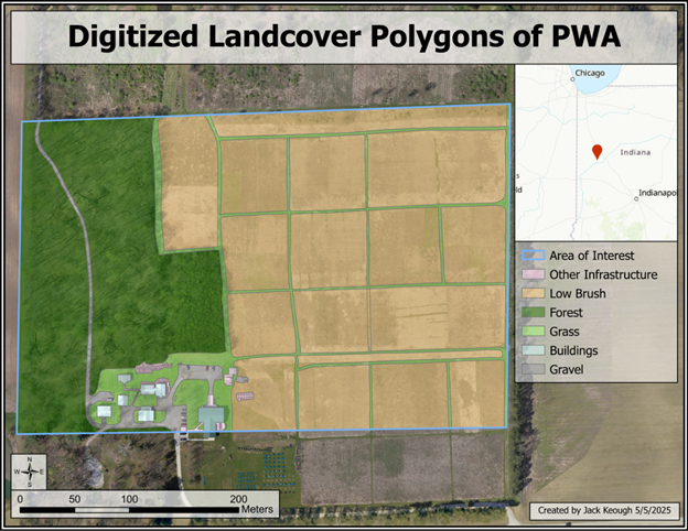
Figure 9 expands on the process done in Figure 8. Whereas the roads are only lines that represent the path of the road and the type of road, Figure 9 features entire polygons that denote the landcover of the area. The different landcover is generalized into low brush, forest, grass, buildings, gravel, and other infrastructure (like the large propane tank seen next to the parking lot). No extra data was added to the polygons like what was done with the roads, as the polygons are each separated by their identity (which is the only thing of concern in this case), however it could be configured to contain more data.
Unsupervised Classification

Figure 10 shows a map in which unsupervised classification of the orthomosaic raster image has been performed. Classification is a process in which the pixels of the raster are assigned or “classified” into categories (5 in this case). This is done to perform analysis of the area utilizing the categories of the pixels. Unsupervised classification refers to a method of classification in which it is performed by a computer algorithm entirely on its own (hence why it is called “unsupervised”).
Supervised Classification

Figure 11 shows a map in which a supervised classification has been performed. In a supervised classification, the training is guided by the user, who oversees creating each of the categories and creating a set of training samples for each category such that ArcGIS can complete the classification based on those criteria. This method, in my case, was better at generalizing the different landcovers, however my lack of experience when it comes to supervised classification meant that it did not come out quite as well as the unsupervised model. My training samples can be seen in Figure 13.
I must note that the original request for the classes included a class for water, however the water ended up causing a significant problem for me. Our orthomosaic only contains an extremely small portion of a pond located on the Southwest side, and the pond itself was more of a brown color than a distinguishable blue. When I tried to do the supervised classification with water included, I was left with the frankly terrible result shown in Figure 12.

The water was throwing off the classification process and causing it to detect everything else as water. Because the area of water is so small compared to the rest of the image, as well as it not even being in the designated area of interest, I chose to go with different classes that excluded water. It simply does not make sense to go through the effort of reclassifying the entire area. Removing the water class fixed many of my problems and resulted in a much better supervised classification result.

Reclassified DSM to show all objects higher than 6 meters

Figure 14 shows a map in which objects higher than 6 meters (with regards to the average height of the whole area) are highlighted in red. This is done by a process called reclassification. Because the DSM contains elevation values for the entire area, it is possible to find out the mean elevation of the area, which is the best representation of ground level. From that, the reclassify tool is used to find areas in the DSM that exist at the mean value of the elevation plus 6 meters, which outputs the result shown above. This is done via an operation that looks like “where DSM >= [mean elevation + 6 meters]. The result essentially just contains areas where trees exists, as they are the only objects in the area that are above 6 meters. This allows the areas above 6 meters to be represented digitally rather than just existing as part of the terrain, which will come in handy later when analysis with trees must be completed.
10-Meter Buffer of Two-Track Roads

Figure 15 uses the digitized roads from earlier to create a 10-meter area around all the two-track roads. Buffering is a common tool used in spatial analysis as part of operations that relate two sets of data spatially. In this case, it is going to be used for an analysis that detects all trees within this 10-meter buffer area.
Raster Conversion of Two-Track Buffer

Figure 16 displays a map in which the buffer, seen in Figure 15, is converted into a raster image. The previous buffer existed as a vector element, which is something that is defined by certain elements of spatial data, which determines its properties. When converting to a raster, all this data is used to convert the buffer into an image that is defined by its pixels. This is the next part of the process that must be used to show the trees within this buffer.
Trees within the 10-Meter Two-Track Buffer

Figure 17 shows the product of the buffer exercises shown in Figure 15 and 16, in which all areas of the buffer containing trees are highlighted. To achieve this, the raster calculator tool must be used. In the raster calculator, a Boolean operation is used to find where the reclassified DSM shown in Figure 14, which displays the areas above 6 meters (which essentially means all trees), and the buffer in Figure 16, exist in the same place. The Boolean operation can be summarized as the statement “Where the two-track buffer AND trees are present (aka “TRUE”).”
Also attached is the raw pdf of this report.


Comments